Thursday, 3 February 2011

HTML texts for newspaper website


This is how my News page looks like. From this picture the text may look fine. However when you are viewing this in a website format the text is basically a picture as you can hardly do anything with it;  you won't be able to zoom in, neither can you copy any of it. This are the main reason why I decided to change the text into a HTML format. 


Adobe Dreamweaver allows me to change the normal text into a HTML one. This is the process that I did; I selected the texts and re-typed it on Dreamweaver itself rather than importing it from Photoshop.  Here, you can see the difference of a normal texts to HTML, the normal one looks rather pixelated and stretched whilst the HTML format looks nice and clear. In addition, if you view this on the web, you can now do things with the text such as, zoom in and copy and paste which you wouldn't be able to do before. 

Saturday, 22 January 2011

Creating my second ancillary product- newspaper website

My second ancillary is going to be a website. I will create the homepage and this will be linked on to the 'News' page. I decided to do a website to advertise/inform/promote my newspaper because according to the research that I have conducted; my target audience prefer a website rather than a radio ad because they find this 'less appealing' and they don't always listen to the radio.  In the process of doing the pages, I used the combination of two programs which are Photoshop and Dreamweaver. I used Photoshop because this allows me to move things easier, it offers a lot of things such as font styles for instance and Adobe Dreamweaver is the program that allowed me to create a website page.  After doing the texts and pictures on photoshop, I had to 'slice' each of the boxes (pictures, ad) on its own as this will make it easier for me to import the page on Dreamweaver. I then adjusted little things on Dreamweaver such as changed the normal texts to HTML texts.


This is how my homepage looked like before. The boxes that I have done are guidelines as to where I'm going to be placing the pictures and articles. I am working on Dreamweaver as you can see from the print screen, there are different options at the bottom of the page such as create text and which font size and style to use. 


This is my final homepage for my website. As you  can see I added a HTML texts rather than having a normal text from photoshop because HTML texts are especially use for websites, so that it is clear and enables readers to do things such as copy an article by highlighting it. In contrast, you wouldn't be able to do this with a normal text imported from photoshop. I also added pictures that are related to the articles. I made sure that my headline is written in standard big, bold font which will hopefully attract the readers attention. I managed to create the page without it looking over crowded yet not too empty. 


This is the 'News page' that is going to be linked with the homepage. I took the chance to be as informative as I could with this page, reason why I decided to add a few articles. I added pictures on the page to make it look interesting and not full of texts.  I made a line after each article to inform the readers where the article ends.  I kept my color scheme of white and blue as much as possible. This is the reason why I decided to make the background for the sidebar color blue; this also goes well with the banner and the link pages . I used plain black text over the blue background because I found out that all newspaper website has this standard black color for the body of the article. 


The previous picture (above) has a big gap on the sides. I decided to put in some of the advert that I originally created on this page.  I am happy on how the second (hyperlinked) page came out, I managed to make it look neat and professional yet not too crowded with texts. In addition I also have an advert and a side bar to make it easier for readers to see the overview of the news on that day/week. 

Ideas for my second ancillary and creating advertisements

I decided to create my adverts on Photoshop because the program allows me to move the text around very easily as I am working in layers. It also offers a lot of choices in terms of font size, style, colors and shapes. 

Firstly, I had to visualize what kind of size I will be creating such as if it's going to be a box advert, long portrait or a big landscape advert. The first one is a square advert, I decided to fill it in with a neutral color for the background because as I said before I don't want the page to have too many colors as I want to keep my color scheme going and by having a neutral brown allows me to do this while giving a little touch (hint of a different color apart form blue and white) on the page. 


I decided that the advert is going to be advertising beads, decorations and jewels, therefore I chose a more classy looking font rather than using a standard one such as Times New Roman or Arial. I changed the font style of the second line because it didn't look good at all because the texts was over the top and definitely too decorative.  I added a picture to make the ad more eye catchy. 


Lastly, I filled in the gap below by adding additional information about the company such as their email, phone number and website. I used the same font as the one below the company's name (Jade Jewels) because I wanted the advert to be simple yet informative and eye catchy. 


other adverts:


Again, I created another advert but this one is more of a simple and straight forward advert. As you can see it has a black background and has a standard text font (Arial). I created this advert because the square advert was small for the rectangle gap that I have on the side of the homepage. I didn't want to ruin the square shape as the advert looked stretched when I tried. I also realized that website features a lot of advert so I decided to add some more rather than just having one. 


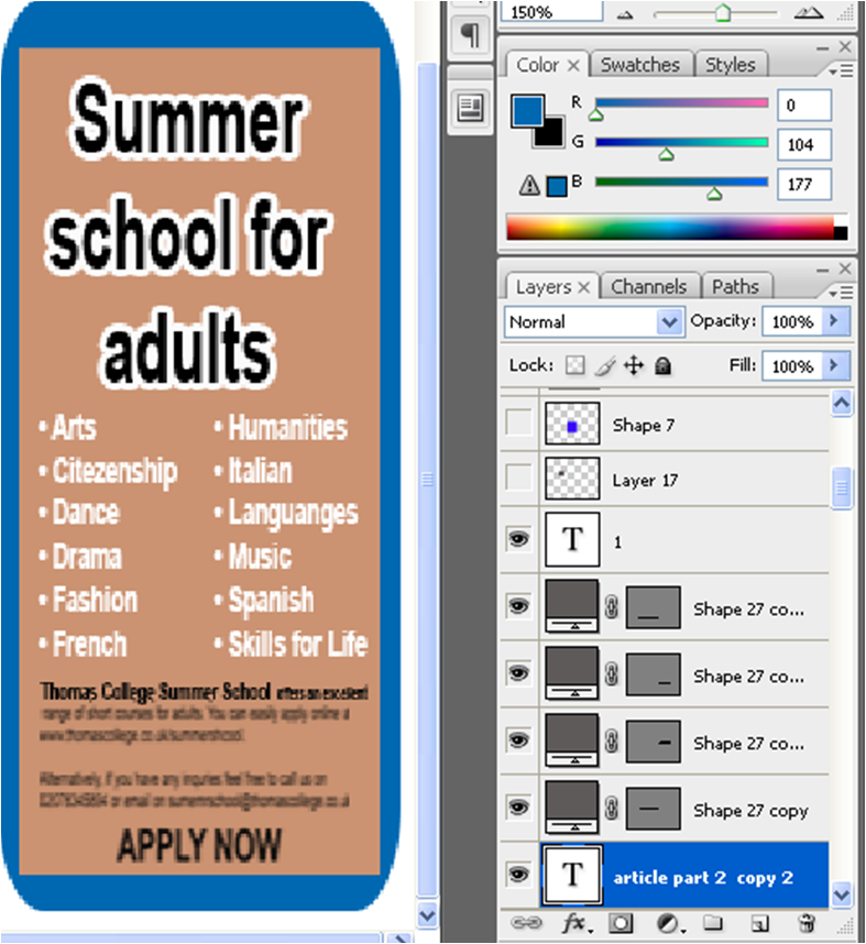
I made another one, as you can see from the print screen I have been using Photoshop. It is such a user friendly program as the options and choices are positioned clearly . There is also a 'Help' tab to click on, which I found very helpful because for example when I typed in 'How to import pictures?' the instructions came up clearly. 

Wednesday, 19 January 2011

Different layouts for my second ancillary- newspaper website


I decided to do a website for my second ancillary because this is a good way to promote my newspaper as well as it would be a good media product for the readers to view as it is accessible anytime they want. I was going to do a radio advert but I changed my mind because I thought that I can target more audience by creating a website and it is less likely for my specific target audience to listen to the radio.


This is the layout that I decided to use because it follows a few convention of a newspaper website such as having the logo of the brand (Lambeth Press) as the banner situated at the top alongside with additional information such as the date, weather etc and also a search engine to make it easier for the reader to access what they are looking for in a much quicker way.  I decided to section the pages in different categories such as News, Business, Travel, Lifestyle and Arts. This is to help the website to have a friendly user effect as well as to make it look clean and professional rather than different types of news scattered over the page. I decided to have some pictures on the page because I don't want it to look over the top with texts and also the photographs can give more in depth information about the articles. I will have a one top headline which will be written in a black, bold and bigger than the other texts, this is so that the headline can stand out and grab reader's attention. Below that, I will be writing an article about the headline that I have chosen and this will be in two columns because like I said I don't want the page to look too busy with texts (so much going on). The homepage will also have a side bar which will contain more latest news, I will do this so that readers can easily see or have a quick overview of all the news and to be able to find out what's going on in general ( local, nationwide and worldwide).  When I was doing my research , all the newspaper website has an advert on their homepage therefore I will follow this convention . I was only going to have an advert on the side of the homepage. However, while I was trying to construct this layout I felt that there  was a big gap at the bottom of the page. I realized that it will be hard for me to find a landscape picture and fit it in the space, because there isn't a lot of space the picture will then look stretched, deformed and pixelated. So I decided to just make another advertisement to fill in this gap. 


Before deciding which layout I will be using for my website, I created different ones so that I can have a better understanding on which one looks the best out of all of that I created.  This one (above) is quite different from that final one that I have chosen. This layout is more crowded and busy. The (menu) name of the different sections of the pages are in a horizontal box. After looking at this final layout I decided that I immediately didn't like it, the main reason is that:  the page looks crowded and the positioning of the pictures and texts aren't nice. For instance, the article for the headline is divided into two columns just like my final layout that I will be using but in this layout the articles are not next to each other which might create confusion for the readers as they may think that it will be two completely different articles. 


This  is a similar one with the final layout that I will be using.  The only difference is that instead of the banner right at the top, it is now below the date, weather and search engine which is fine but I still prefer the final layout because I think  the positioning of that one is  better.  Also, this one will contain a video which means that I need to input extra effort as I will need to record my own original video for it. 


This layout (above) is also good because I think it also looks professional just like the final one that I have chosen. However, I felt that the advertisement space at the bottom of the page is too stretched and it will be hard to fit one within this amount of space. 

Monday, 17 January 2011

Research on second ancillary- Newspaper website

My second ancillary is going to be two hyperlinked pages for my newspaper. I have been doing my research on this; I went and analyzed different newspaper websites to give me a deeper understanding on how the website looks as well as to explore its forms and conventions. I looked at quite a lot of different websites; however I decided to focus on two websites which are: London Evening Standard  http://www.thisislondon.co.uk/standard and South London Press  http://www.southlondonpress.co.uk/ .


The ‘London Evening Standard’ website has a white and orange colour scheme, which represents the newspaper’s identity as the colours used for their logos are similar to their website; white background, black texts and orange block of line. These are some examples of their newspaper posters as you can see the colour scheme again remains similar.
As you can see from the print screen picture of their website they have links to different pages such as; news, business, money, sport, video, entertainment, travel, games etc. The page looks user friendly as the layout looks nice and clean, the articles are clear and easily accessible.  The titles of the articles are eye catching as the fonts are in blue while the rest of the texts are in black. They also take advantage of different kind of medias as they add videos, soundtracks and pictures on the page. There are obviously adverts the company obviously needs to produce profits and banner ads in headers can be one way of their source of income.


South London Press and The Evening Standard are similar in terms of the common colour white for the page background with black texts and using blue for the headlines to make it easier for the readers to identify the main topics. Their colour scheme is blue and white as most boroughs in South are associated with colour blue (such as boroughs of Lambeth and Southwark for example). Both newspaper website has the articles in the middle of the page and adverts on the right side of it. Both shows a lot of advertisements however, this seems to be normal as it is one of newspaper's conventions to feature as much ads. In addition, both page colour schemes complements their ‘hard’ copy of newspaper.
Overall, I realized that most newspaper websites use dark text on a white background and I found out the reason for this; it's because these websites contain a huge volume of content and the page should be readable therefore black text and white background are the most common combination. In addition, a lot of news website tend to use blue and red colour for texts; blue is very common for headlines, titles, articles and even links while red is often used sparingly as an accent color. I now have a better understanding on how newspaper websites are, it's composition and conventions. I now feel more confident in creating my own website I will be doing this on Dreamweaver. 


This picture explains how online journalism is continually evolving in terms of its layouts and choices on the page. As you can see, few years ago it completely looks simple and straight forward. The banner is on the top as usual but the article took up most of the page and adverts on one side and at the bottom ( just how I will position my adverts because I think this idea looks good and effective as it has been a convention for websites which I want to follow). In contrast, we can clearly see on the picture that today newspaper website has advertisements all over the page. For instance in this example; there are ads at the top bottom and side which takes up most of the spaces on the page.

Saturday, 15 January 2011

Questionnaire for my second ancillary

Marketing is vital in every business as this can determine the success or failure of a company. At first I couldn't decide, whether to do a radio advert or a website. Both have its benefits and drawbacks. A radio advert is affordable and an effective medium for delivery of advertisement to targeted audience. However, it depends on who the target audience are and also some people don’t even listen to radio anymore as there are a lot of other media that they prefer such as the television. On the other hand, website advertising can also be so powerful and cost effective tool to get to audiences. It’s excellent because it can provide a maximum exposure for my product than any other form of advertising. However, this might require a professional IT to do the website properly and effectively, which means that this will costs the company more money. I didn’t know which one to do for my second ancillary so I decided to ask my target audience on which form of advertising would they prefer.

According to the survey that I have taken, a more than half of the audience (60%) preferred a website, 30% wanted radio advertising and the 10% voted for other forms or ads such as television or maybe they are just not bothered and they don’t really mind which one. This has helped me to decide on which one to do for my second ancillary. I will now be doing a website to promote my Lambeth Press newspaper. But before I go ahead with it I will be doing another survey in oerder to ensure that I am on the right track.


This pie chart shows a clear result that the majority of people (75%) have an internet access which seems that I am right in deciding to do a website rather than a radio advert.


I also asked my target audience on how (which device) do they use in order to access the internet. Nearly half of them (45%) said that they use a computer. This is true as we are living in a very modern, technological world; most people in the world are computer owners.  There were also a lot of people that said that they use a mobile phone to access the internet, so when doing my website I have to make sure that my pictures are clear and in high quality so that when the readers access the newspaper through their mobile device, hopefully the pictures won’t turn blurry or neither pixelated.


Lastly, majority of my target audience said that they have access to the internet which is excellent as this increases the chance of them visiting Lambeth Press’ website. Also, only 5% said that they do not have an access with the internet at all which proves that I probably did make the right decision in making a website for my second ancillary.

Wednesday, 12 January 2011

Final Local Newspaper Poster


This is my final newspaper poster, this will promote Lambeth Press. The difference between this and my draft is that instead of having a block of background color yellow I decided to change it to light blue. I chose yellow before because I thought that this will be good as it is a bright color and therefore this will attract reader's attention. However, when I changed the photograph on the page it  was contrasting with the bright yellow. Also, the blue scheme is the theme for Lambeth Press, which makes it a better idea to have this because readers can easily recognize the color which is hopefully associated with the newspaper that I am creating. From my draft I had two pictures next to each other but I changed this to one portrait picture instead because this is what I learned form my audience feedback. They thought that having two pictures next to each other in a newspaper poster is very unusual therefore they suggested to use a portrait picture instead as this will look better and will be following the norms of a poster. I added a tagline below the nameplate because I thought that I need to encourage the consumers to have a look at Lambeth Press and also as this is the newspaper's first launch I then made it clear by saying that it's 'out now'.