- How does your media product use, develop or challenge forms and conventions of real media products?
- How effective is the combination of your main product and ancillary texts?
- What have you learned from your audience feedback?
- How did you use new media technologies in the construction and research, planning and evaluation stages?


For my A2 Advanced Production Portfolio I decided to create the first two pages of a local newspaper (front and inside page) together with a newspaper poster and website (two hyperlinked pages) as my ancillary tasks. I decided to do those media product because it will be completely different to what I did during my Foundation Portfolio and I know that by doing this I will be able to carry on using the knowledge and skills that I learned as well as adapt more media skills such as using Adobe Dreamweaver for instance.
This is an example of a real media product. This is South London Press' front page and inside page.

1. My products followed, developed and challenged forms and conventions of real media products. I named my local newspaper Lambeth Press, as people aren't aware of it yet I had to make an identity for the product. I had to establish the brand by creating its unique logo which was used through out all the pages such as the newspaper front page, inside page, poster and its website. This is to show Lambeth Press' brand identity and for the readers to be able to differentiate my products against its competitors. In addition, I had to choose a colour scheme and I decided that it will be blue and white because according to my research colour blue is very much associated with the borough of Lambeth.


For my newspaper's front page I followed the convention of having a black, big and bold headline to make sure that it’s attractive enough to engage the readers with the article. I made sure that the lead headline is also in bold and a little bit bigger font size than the rest of the texts; this is to summarize what the article is going to be about and indicate that this is where the article begins.
For all of the products that I created I made sure that the color scheme of blue and white is used for all the pages. I also added the logo with it so that readers can identify the brand immediately as soon as they see any of the media products. All the articles are written in columned paragraphs because this is a very popular convention of a newspaper that I felt I must follow. I made sure that necessary information are displayed on each pages such as the date, price and captions of the pictures. As newspaper feature a lot of advertisements, I made sure that I dedicated a good amount of space for the adverts on each pages of my products. I made sure that the adverts are what my readers can relate to such as summer events.
I followed the convention of a newspaper layout however I decided to develop it by positioning the texts and picture quite differently in comparison with a standard layout. For the side bar, I added bullet points, which tends to lean in the middle of a newspaper and magazine norms. I took the risk of putting bullet points as I thought that it suited the page well and also some newspaper has bullet point in some of their front page. In addition, I challenged conventions of real newspaper by including modern story lines for a younger audiences as well as the norm article. I am aware that my target audience are not the younger generation however I came to a conclusion that those people are mostly parents or somehow related with someone that is included in the 'younger generation' today. For instance I added an article about education such as 'Tuition fees going up to £9000', I am aware that this will directly affect young people but I know that this will also generally affect other people in the society.
 |
| This was when I was in the process of doing my original advert |
I followed the convention of a newspaper layout however I decided to develop it by positioning the texts and picture quite differently in comparison with a standard layout. For the side bar, I added bullet points, which tends to lean in the middle of a newspaper and magazine norms. I took the risk of putting bullet points as I thought that it suited the page well and also some newspaper has bullet point in some of their front page. In addition, I challenged conventions of real newspaper by including modern story lines for a younger audiences as well as the norm article. I am aware that my target audience are not the younger generation however I came to a conclusion that those people are mostly parents or somehow related with someone that is included in the 'younger generation' today. For instance I added an article about education such as 'Tuition fees going up to £9000', I am aware that this will directly affect young people but I know that this will also generally affect other people in the society.

2. Narrative- My newspaper front page headline and the headline on my newspaper poster are linked together as they are both the same article. I chose to use the article on my front page because I think that this was the most eye catchy and interesting article in my newspaper. My inside page and websites links together as they have the same articles. However the articles are more explained on the website because the newspaper page has obviously limited space.
Genre- My genre is local news, I made sure that the news that I covered was all related to the Borough of Lambeth. However I wanted to feed my readers more information so I included other national/ worldwide news that will affect them such as tax rises, pensions and general health news.
Representation- For all the media products that I have created I made sure that I kept the colour scheme of white and blue. I kept in mind that I should be targeting the same target audience, reason why I decided to not have too many colors on the pages as (colorful/rainbow colors are more associated with young people). I put the logo in all of them so that readers can easily differentiate Lambeth Press from its competitors.
This are the first questionnaire results that I got from people in general. It gave me an idea on who should be my target audience are, what will be the reasonable price for my local newspaper. As well as the preferred title for it.


This are the first questionnaire results that I got from people in general. It gave me an idea on who should be my target audience are, what will be the reasonable price for my local newspaper. As well as the preferred title for it.


3. From the audience research I carried out for my final product I received both positive feedback and minor criticism. Few of my target audience criticized my newspaper poster; it was mainly because I was trying to challenge the convention of my newspaper by breaking within its color scheme. I added bright yellow on the newspaper poster because I thought that this would be a good idea, as it will subconsciously attract reader’s attention because of its brightness. For the reason of the criticism I received from my audience, I decided to change it and keep with the blue and white scheme. In contrast, the majority of my target audience thought that the use of text and pictures in all the products that I have made balanced so well together because it's doesn't feature a lot of photographs but yet it doesn't have too much text which makes it less boring looking. I was pleased as they described the pages as 'consistent' and 'professional'. They also commented how the pages are interesting, which is excellent as this attracts their attention. They said that the website is easy to navigate and it looks lively and definitely doesn't look cluttered at all as the articles are clearly separated from each other. When I changed the colours for my draft of newspaper poster the audience immediately thought that within the pages I created; the appearance looks well as it is simple, effective and colourful without it being overpowering. In addition, they also thought that the headlines and the message on the poster was understandable, eye catching and easy to understand. I learned that having big gaps even on the side of the page doesn’t look nice as normal website usually have advertisements to fill those spaces. I made sure that important features was there such as the Lambeth Press’ logo and its colour scheme runs through in all my media products as my audiences suggested because it will be easier for them to identify the newspaper in the future. Also, they recommended that I should use HTML texts rather than having a plain text (from Photoshop or InDesign for instance). I done exactly what they have said and I saw the difference; HTML texts looks so much better and more clear.

4. I have used different media technologies in the construction, research & planning of my newspaper. For my research, I used the Internet which gave ma a lot of information on what I needed to know such as the conventions of newspaper itself, poster and websites for local newspapers. Internet didn’t just offer texts but also pictures, graphics, audios and videos that made me understand what I was researching for in more depth. The process of researching on the Internet is very fast, results are shown in seconds. However, I had to be sure that the websites I was going on was reliable as anyone can post anything on the web.
For the images in my media products I used a digital camera and a professional camera (Nikon D5000), which made the picture, looks good as the pixels and quality of it is very high.
 |
| NIkon D5000 |

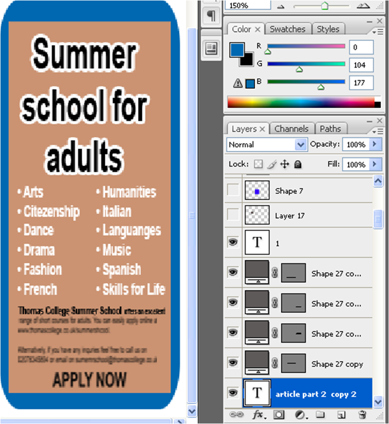
At first, I found Adobe Dreamweaver very challenging because I had no clue how to use it as it looked complicated because of the codes and HTML that is involved with it. However, after doing my research I surprisingly found the program easy to navigate. I wouldn't say that it's simple and straightforward but fortunately I was able to do the basics to be able to create my own website. Dreamweaver enabled me to turn my standard fonts from Photoshop into HTML format. I had to change my fonts into HTML because it's more readable and it will enable my readers to do a few things with it such as copying the texts from the website. Overall, Adobe Dreamweaver allowed me to create my own website. The frames and templates make layout design quick. The HTML code and design view can be displayed separately and I was able to create pages in standard or layout mode for different design options. But the toolbar and properties provided too many options for me; this is the reason why I had to do a lot of research on how to use and work with the program.
Overall I very much enjoyed doing my Advanced Media Production Portfolio because not only that I gained new skills and knowledge but I was also able to use the ones that I already knew. At first, I thought that taking pictures for all my media products will be hard but I surprisingly had fun with it as it is going to be a local newspaper I was able to take pictures around my area and made them realistic by creating an article for the photos that I added on the pages. Through out the whole process I used my common sense, skills and creativity which I think works as I considered all my final products up to standard and professional looking. I am happy with my final piece, as I have done enough research and took them into account, all the details that I have on each pages are simple but yet effective.
No comments:
Post a Comment