Firstly, I had to visualize what kind of size I will be creating such as if it's going to be a box advert, long portrait or a big landscape advert. The first one is a square advert, I decided to fill it in with a neutral color for the background because as I said before I don't want the page to have too many colors as I want to keep my color scheme going and by having a neutral brown allows me to do this while giving a little touch (hint of a different color apart form blue and white) on the page.

I decided that the advert is going to be advertising beads, decorations and jewels, therefore I chose a more classy looking font rather than using a standard one such as Times New Roman or Arial. I changed the font style of the second line because it didn't look good at all because the texts was over the top and definitely too decorative. I added a picture to make the ad more eye catchy.

Lastly, I filled in the gap below by adding additional information about the company such as their email, phone number and website. I used the same font as the one below the company's name (Jade Jewels) because I wanted the advert to be simple yet informative and eye catchy.

other adverts:
 Again, I created another advert but this one is more of a simple and straight forward advert. As you can see it has a black background and has a standard text font (Arial). I created this advert because the square advert was small for the rectangle gap that I have on the side of the homepage. I didn't want to ruin the square shape as the advert looked stretched when I tried. I also realized that website features a lot of advert so I decided to add some more rather than just having one.
 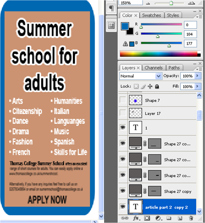 I made another one, as you can see from the print screen I have been using Photoshop. It is such a user friendly program as the options and choices are positioned clearly . There is also a 'Help' tab to click on, which I found very helpful because for example when I typed in 'How to import pictures?' the instructions came up clearly.
No comments:
Post a Comment