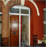
I am now working around the photographs that I originally took; I am currently planning which ones will suit my articles more and how I should edit the photos to make it look better and more professional. I will be using Adobe Photoshop as this is the most suitable program to use in editing pictures because users are able to do things in a more simple way such as; edit/remove the background of a picture, turn a coloured picture into a black and white, resize, edit the lighting and contrast, etc.
 What I was trying to do with this photo is I planned to write some of the headline on the side (wall) of the picture. As you can there is loads of space on the side of the original photo, so I decided to crop the final one on both sides because I thought that writing the headline on the picture wasn't looking too good for my newspaper.
 I will be using this photo on the sidebar of my newspaper page (car accident article). I didn’t edit it as much, apart from cropping the picture as you won’t be able to see the car properly because the image will be resized in a much smaller size.
I have no plans in editing this photograph because I think it already looks good as it is. I think the quality is excellent therefore I don’t need to edit the lighting and contrast of the picture.
I decided to use this photo for my inside page (young entrepreneur article). I didn’t edit this picture because this is how exactly I wanted it for my newspaper.
As far as this, those original photographs above are the ones that I will be using for both my front and inside page. However, there is still a chance that this might change because it will depend on how it looks on the page when it’s all done including the articles, as well as the advertisements.


No comments:
Post a Comment