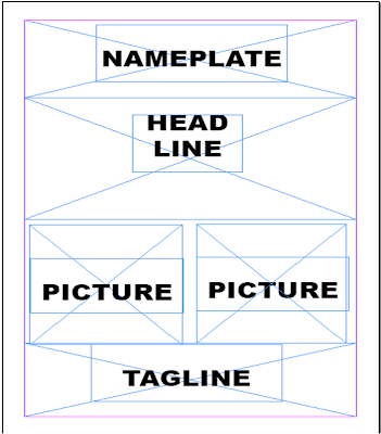
After my research I now have an idea and understanding on how should I do my own newspaper poster layout. I used Adobe InDesign to play around with different layouts that I will be using for my first ancillary task. These are some of the potential layouts that I have done:
For this first layout as you can see above, I followed some conventions of newspaper posters by having
a nameplate and a tag line. I did this because I am aware that nameplate is such an important thing because this is what tells the reader which newspaper I'm advertising and also this differentiate my newspaper fro its competitors. I decided to add a tag line to make the poster even more persuasive. I am planning to do the headline in a big, bold, black fonts/letter. However, I decided to challenge some convention by adding two pictures on the page because newspaper poster usually has only one photograph or doens't have any at all.
This second layout is quite similar in comparison to the first one as the positions of the nameplate and tag line are the same. There will obviously still be a headline and a picture however, the positions of those will be different. This layout is challenging in terms of following the normal newspaper poster and also it looks like this is going to be tricky as the picture is portrait long length one which means that I will need to take a photo that perfectly fits this layout.
This looks simple yet straightforward. When I was making this layout, my intention was to completely try to follow the convention of a poster. However, I decided to switch the positions of the nameplate and the tagline because I think this might be more effective as the headline is on the top and will subconsciously be read first.


No comments:
Post a Comment